A redesign of the club’s badge was always on the agenda of former Villa CEO Tom Fox, as he attempted to revamp the club’s commercial concerns. Unfortunately, what Fox didn’t realise fully was the foundation of the business of a football club is firstly cemented by the product on the pitch.
The badge change was commissioned earlier in the season seemingly aimed at the digital side of operations. The club held limited off the radar ‘consultation’ with some fans regarding both the badge and also website re-design. While MOMS knew about this for some months, we were never approached by the club (a mistake they seem to keep repeating to their own detriment).
Should it have had wider supporter consultation? Especially when you have an owner who wants to sell up, so there could be a new owner in a year or two seeking a new image and badge for the club.
NEW BADGE
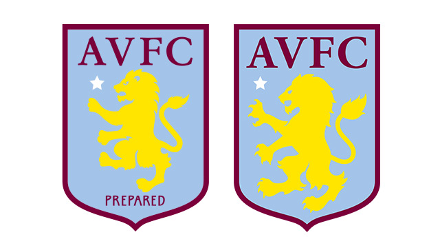
The new badge was registered on 28. 8. 2015 over a widespread of trademark categories. The main concern though is there is very little difference between this new badge (right) and the old (left).

Out goes the ‘Prepared’ motto and the lion is a more ‘wilder’ variation on a theme. It actually could be mistaken for an outtake from the initial design drafts for the previous badge.
While the badge in isolation isn’t a bad design, it doesn’t divert enough from the original badge design to justify the expense of updating all the relevant physical and digital properties.
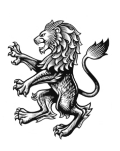
Interestingly, four months later a fully-detailed lion was registered on 22.12.15 for bag, clothing and toys categories also. The lion in more detail actually looks more eagle-like in its face design. It certainly works better in silhouette.

REASON
The purpose of the redesign the club states was ‘undertaken to make us more effective in the digital age’. It explains the removal of the ‘Prepared’, which wouldn’t show up clearly on social media platforms for example, but if you’re going to change with digital as your focus, then surely a circle badge design would be better suited to the job rather than an awkward crest/shield?

It was certainly at the forefront of MOMS thinking when we decided on a My Old Man Said circular badge.
The word on the street is many fans and club backroom staff during the consultation process favoured a round design. It’s no secret that there’s constantly been an outspoken call from some Villa supporters for a return to the early 1980’s round badge design.
Repercussions
While a new kit manufacturer in Under Armour will herald a new range of kit sponsor merchandise anyway, the in-house merchandise will need updating. All the signage in the stadium and around the ground will need changing. The signs and also the mosaic outside the Holte End will need updating too.
The club has quoted £80,000 for the update work (and not the £2 million in the press), but this is only the immediate work they have scheduled to do in the summer, with changes in the stadium to be kept to a minimum (but it will be an eventual cost; probably only undertaken, if the club gets promoted!)
What do you think of the new design? Are you upset there wasn’t a wider supporter consultation process? Remember Everton fans recently overturned their club’s new ‘modern’ design when they weren’t consulted properly.
Follow MOMS on Twitter – @oldmansaid

Just go back to the roundel of the early eighties,no mistaking our colours which are claret and blue not yellow and blue as again in this revamp the claret isn’t prominent enough.But in the shambles that is currently Aston Villa this is the least of our problems.
Think the issue with the positioning of the star is a EUFA rule and only teams that have won the Champions League can have the star above the badge. As we won the European Cup we have to include the star in an alternative position.
Regardless of this the badge is cap and we should have kept the round seventies style badge for me!
It should be bent over with a Fat Cat yank taking advantage from behind while no one is looking!
What another wonderful value for money venture. Shold the important people the fans have been asked. Well they were. Remi garde, Fox, I’m sure even Faulkner had his input. Don’t you just wish that you had been the marketing genius that thought of removing the word prepared from the badge? Well prepared is not something we have been since Learner took over. I’m sure they will put the badge right soon, replacing the proud lion with a mouse maybe? Nah mice are far too workmanlike. A dead mouse then? Nah I think the badge would be a better representation of the club’s current standing if it was just a white badge on a white background.
Rapidly losing interest in this lot. A club first and foremost should be about the actual game at the weekend. There’s just nothing to celebrate ever in any way. They’re a joke!
The basic badge is totally wrong ! the star is n the wrong place, all Champions League winners (European Cup then) have this coveted star is always above the badge most times on the shirt, same with countries who have won the world up. Being above the lions paw it totally negates its importance.
The current board must have approved this so maybe the monumental incompetence continues.
I never want to see Villa again- sick to my stomach of it all
Steve
The glaring error with this and the previous badge design is that the star for winning the
Champions league (then European Cup) is completely in the wrong place, all winners throughout
Europe position this star/s just above the badge shirt,same with world cup winning countries.
Ours is just above the lions paw has no significance whatsoever. Beyond belief.
The club is just a train crash and I for one can’t take any hope from anywhere at the moment and the new board is already starting to worry me, lots of huge salaries. Presumably the new board had approved this design.
Steve
Can’t agree more on the star, Steve. Works better in gold as an accessory to the crest (Centre top), and would allow the paw to be re-positioned slightly as for my eyes its a tiny bit out.
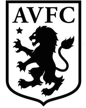
Happier, some further changes needed but the teeth n claws have been lacking, on and off the badge. I prefer a crest but the circle is tidier for design purposes. And I understand blue background to clash with claret kit but the club colours are claret n blue. Like a gold lion on claret background with no clutter, move the lettering out too, like in a ring around it, include the motto. The B&W image is superb, perfect for polo shirts. Irony of this is the first story I liked outta Villa FC for a while, and its a leftover from Fox. Even if at 80k they got ripped.