
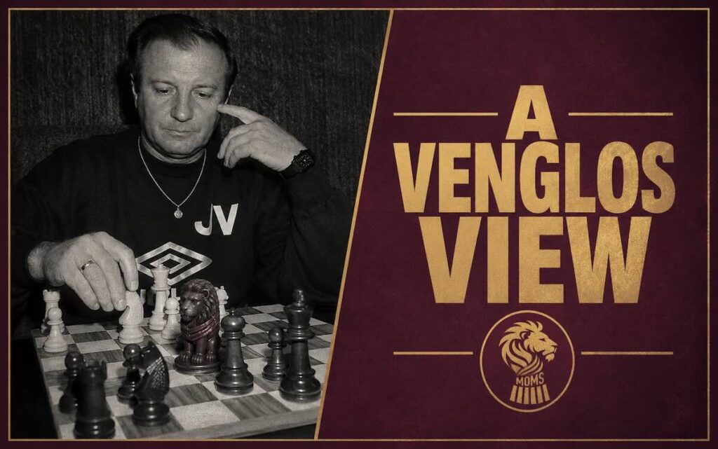
The Curse of the Claret Sleeves
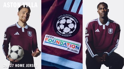
Aston Villa and Adidas have unveiled the new 2026-27 home kit, describing it as inspired by ‘the club’s designs from the 1960s’, although failing to mention that it specifically takes it lead from the ill-fated 1969-70 season strip that was abandoned mid-season.
There is a pattern in Aston Villa’s kit history that the marketing department would prefer you did not think about too hard. The traditional Villa shirt — claret body and sky blue sleeves — has been the club’s identity for the better part of 150 years. Tamper with it, specifically remove those sky blue sleeves, and something unpleasant tends to follow. This is not a superstition so much as a documented sequence of events.
We have been here before. Three times, in fact.
1969-70: The Original Curse
In preparation for the 1969-70 season, the shirt that the new Adidas home shirt takes its lead from, was introduced, and considered a radical redesign at the time. The contrasting blue sleeves, worn for more than 75 years, were dropped. As Tommy Docherty looked to change the club’s fortunes. In came a flappy collar with a V-inset, light blue shorts (the first time that particular combination had been tried) and the familiar crest was replaced with a lose Scottish lion rampant in light blue above the letters AV.
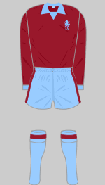
By January 1970, Villa were bottom of the Second Division and Docherty was sacked. The board immediately petitioned the Football League management committee for permission to abandon the kit and return to the kit from the previous season. The request was granted, but it was too late to avoid Villa dropping to the Division Three.
The following season, while Villa retained the collared style, they restored the traditional sky blue sleeves. Lesson, apparently, learned.
1983-2001: Ignoring History
History’s first lesson evidently wore off. When Le Coq Sportif introduced claret sleeves for the 1983-84 season onwards — and Henson continued the approach from 1985-87 — Villa embarked on one of the more spectacular declines in the club’s history. From European Champions and Super Cup winners in 1982 and 1983, they were relegated by the end of the 1986-87 season. Five seasons of claret sleeves. Five seasons of steady, inexorable decline.
The next time Villa reverted to claret sleeves was the 2001-02 Diadora kit. In January 2002 of that season, John Gregory made something of a surprise resignation as manager. With Graham Taylor taking over for his underwhelming and at times embarrassing (see Blues derbies) second period in charge.
January. Again. As in the case of Docherty.
Non-negotiable Design
For a section of the Villa support, the sky blue sleeve is not a design preference. It is a non-negotiable. A structural requirement. The thing that separates a Villa kit from a kit that is merely claret, as several Villans recently pointed out on MOMS Facebook page.
“Sleeves should always be blue.” — Ken Baldwin
“Should always have blue sleeves!” — Philip Stickley
You get the idea.
2026-27: Adidas Challenge the Football Gods
When Aston Villa and Adidas have unveiled the home kit for the 2026-27 season they described the look as “clean and elegant”. The authentic jersey uses CLIMACOOL+ technology for ventilation and moisture management, the latest made up word to justify a price tag north of £100.
The claret shirt arrives with shorts and socks in a shade Adidas are calling glow blue. Whether naming things “glow blue” while removing the actual blue from the shirt sleeves registers as irony is a matter of interpretation.
The launch has been accompanied by a well-received and charming short film shot in the style of a Pathé newsreel — traditional voiceover, fast-cut structure, suitably grainy aesthetic — featuring first team players, Unai Emery (in a great 1960’s coat), and club legends with the European pedigree nodded to appropriately.
the glory days are back 🩵
— Aston Villa (@AVFCOfficial) May 26, 2026
26/27 Aston Villa Home – absolutely marvelous 😉 pic.twitter.com/9gODKqrOfL
Adidas will be hoping to continue the fun of the ad and avoid any of the clouds of doom that claret sleeves have traditionally brought to the club. They will point to the claret sleeves of the shirt that Luke 1977 lent their name that was worn during the play-off winning season of 2018/19, the last and only successful ‘claret sleeve’ season, although that might have had more to do with a returning Jack Grealish and outspending the rest of the Championship.
Fan Reaction
As for the supporters? Well, the shirt will probably look better on them in a casual wear sense, than the players. Responses, as they tend to be, have been varied, to put it diplomatically.
“This is the strip the players will be wearing when they lift the Super Cup and the league next season.” — Brian Wardlaw
“Looks like a retro or throwback kit to me. I do quite like it though.” — Ian J Scrivens
“Only thing that lets this kit down is the badge.” — Matt Joseph
“It really is quite the fashion crime. I get the whole retro vibe, but they’ve done a terrible job on this one.” — Simon Maslak
“Someone at adidas got paid to come up with that? Shocking. Looks like a polo shirt or training top.” — Steffano Davies
“Great. Going to look like a darts player.” — Geraint Custard Shide
“Did Mrs Doubtfire design this?” — Andy Kemp
“All the negativity, no pleasing the Villa fans lol — well, I like every Villa top, I’m buying it.” — Michael Shale
Brian Wardlaw’s optimism is noted. Villa are Europa League holders. The Champions League beckons. The Super Cup is on the horizon. There has never been a better time to banish the claret sleeve curse.
UTV
Check out all the 2026-27 home kit options and new training range, here
Disclaimer: A Venglos View accepts no responsibility for any January managerial departures, unexpected relegations, or Football League petitions that may occur during the 2026-27 campaign.
The Asics kit in 94 had claret sleeves & we won a cup!
Technically, I have that down as a striped shirt, it’s not the normal design of coloured body & separate sleeves, as the shirt was all one design.
Who gives a fuck … VTWD !!!
A rebuke to this is that we had claret Sleeves in 2018/19 and that worked out ok.
It is mentioned in the article, you know.
There’s no curse – we won promotion in 2019 in a predominantly claret shirt without blue sleeves. This is just a superstition with no merit.
Apart from all the major bad stuff that happened (European Cup winners to relegation) and the actual shirt the new one is modelled on, not even making it through the season. You must have missed all that?
Don’t like it a bad omen it should have blue sleeves not a lot of thought gone into this
I’m sorry, that looks like a non fitting works polo shirt to me, l think it would have looked even worse with blue sleeves